
Colour is the decision buyers agonise over most, and for good reason: it sets the whole feeling of a room and it is not something you change on a whim. The good news is that SPC gives you the full spectrum of wood and stone looks without the maintenance of the real thing. Here is a practical way to narrow the field.
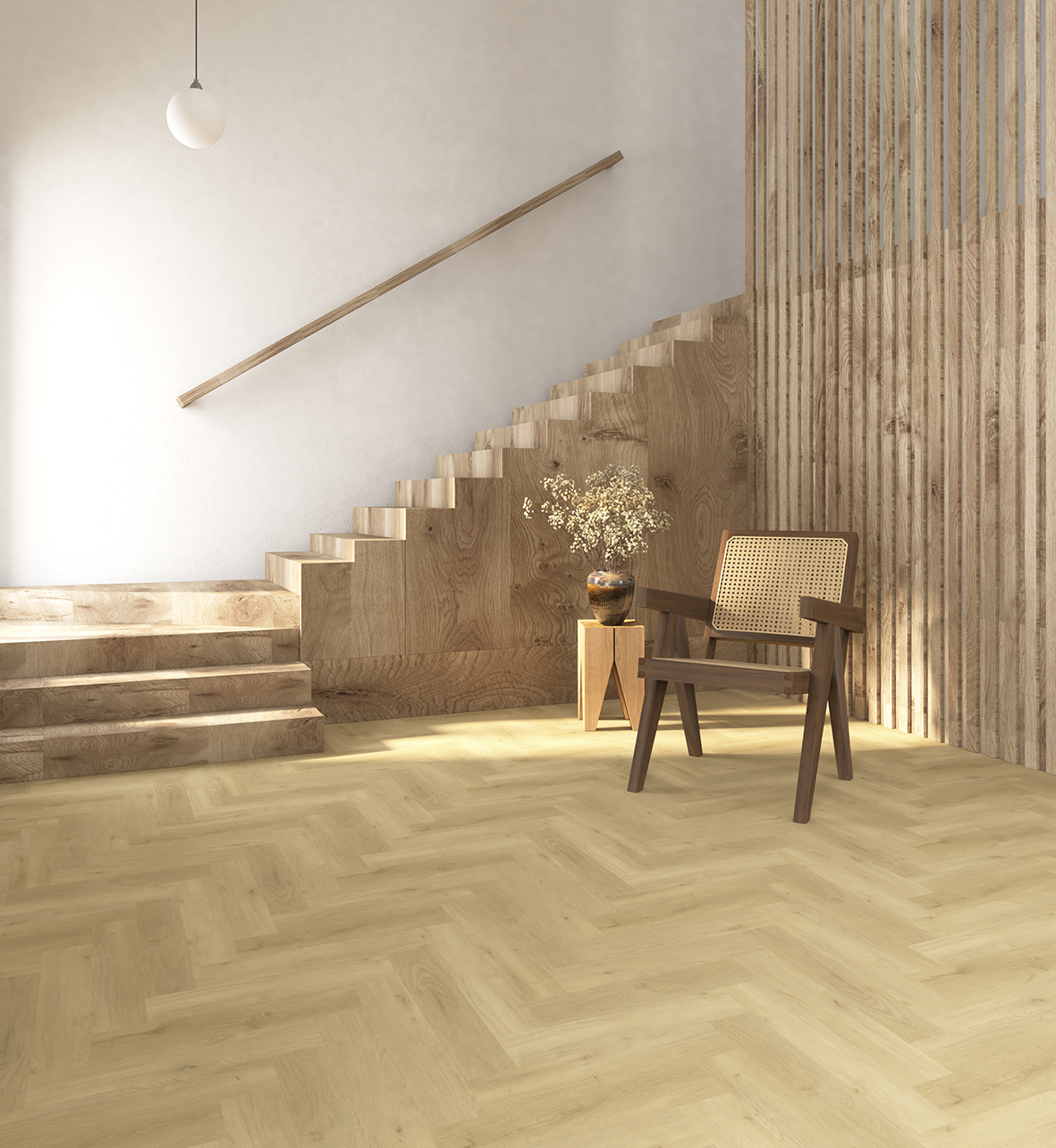
The wood tones people reach for
Most projects land in one of four families. Each does something different to a space:
- Light oak: airy and clean, bounces daylight around, makes smaller or north-facing rooms feel larger
- Warm natural: honey and mid-brown tones that feel inviting and forgiving of everyday wear, a safe choice for busy homes and hospitality
- Greige: the grey-beige middle ground that reads as neutral against almost any wall colour and furniture
- Dark walnut: rich and grounding, adds drama and formality, best where there is enough light to carry it
Stone looks for a different mood
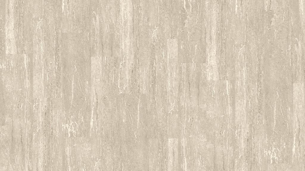
Not every space wants wood. Stone-effect SPC suits bathrooms, entrances, and contemporary commercial interiors, giving the cool, solid feel of tile with a warmer, quieter floor underfoot. It pairs well with minimalist and modern schemes where a wood grain would feel too soft.
Why texture makes or breaks realism
A printed image alone looks flat. Our EIR (embossed-in-register) surface aligns the physical texture with the grain in the design, so the dips and ridges you feel line up with the knots and lines you see. That registration is the difference between a floor that convinces at close range and one that gives itself away. It also catches light the way real timber does, which changes how the colour reads through the day.
Matching the floor to the interior
A few habits that keep choices safe: pick the floor tone against your fixed elements (worktops, doors, large furniture) rather than paint, which is easy to change later. Lean lighter to open up a room and darker to make a large space feel intimate. And view samples in the actual room at different times of day, because artificial and natural light shift a tone more than most people expect.
MILAT's range
We offer 3 collections spanning 54 designs across wood and stone looks, so most schemes find their match in the standard range. For projects that need a specific shade or a brand-matched look, we also produce custom colours and sizes. If nothing off the shelf is quite right, we can talk about developing it.
Want physical samples to compare in your own light? Email sales@milatfloor.com or call +90 535 960 79 46 and we will get the right options to you.
The same decor in different light
A floor colour is never just the colour; it is the colour multiplied by the room's light. North-facing rooms cool everything down, so a decor with warm undertones keeps them from feeling grey and flat. South-facing rooms warm and brighten whatever you lay, letting cooler, paler decors stay crisp instead of turning yellow. Artificial light matters as much: warm-white LED strips will amber a pale oak in the evening. The practical rule never changes: judge large samples laid flat, in the actual room, at more than one time of day. A colour chosen under showroom lighting is a guess.
Undertones: why two browns refuse to match
When a floor clashes with a kitchen or a door frame, the culprit is nearly always undertone, not shade. Every wood decor leans somewhere: red, orange, yellow, grey or beige beneath the surface colour. Two mid-browns with opposing undertones will fight each other forever, while a light and a dark floor sharing an undertone can sit happily in adjacent rooms. Check undertones by placing samples against a plain white sheet, which exposes the lean instantly. Then match the floor's undertone to the fixed, expensive elements of the room, cabinets, stone and joinery, and let paint and textiles adapt around it.
Practicality by colour: what hides what
Every colour keeps a different secret. Choosing with this table in mind saves years of extra mopping.
| Floor tone | Hides well | Shows readily |
|---|---|---|
| Very dark | Stains and shadows | Dust, lint, pet hair, scratches |
| Very light | Dust and pet hair | Dark stains and scuffs |
| Mid-tone with grain variation | Almost everything day to day | Very little |
| Grey and greige | General soil | Warm-toned crumbs and dust |
This is why busy family homes and commercial spaces gravitate toward mid-tone woods with visible grain movement: the pattern camouflages daily life between cleans. An EIR texture strengthens the effect, because surface relief breaks up reflections that would otherwise spotlight every speck.
Colour as branding in commercial spaces
For shops, cafes, offices and hotels, floor colour is a brand decision before it is a decorating one. A pale Scandinavian oak signals something entirely different from a smoked dark plank or a polished-concrete look, and chains increasingly standardise one floor decor across locations precisely to make spaces recognisable. This is where manufacturer capabilities matter to buyers: MILAT produces custom colours alongside its three collections and 54 designs, so a retail chain or hotel group can lock a signature tone into its fit-out standard and reorder it consistently as new locations open.
How a new decor is actually born
Buyers sometimes imagine floor designs are picked from a catalogue of prints. The reality is closer to product development. A manufacturer watches interior trends across its export markets, selects or commissions decor films, and then does the part that separates good from ordinary: matching the embossing to the print. In an EIR product the texture plate is registered to the design, so a knot you see is a knot you feel. Colourways are tested against different room lighting, graded for repeat frequency so large floors do not show obvious pattern repetition, and only then does a decor earn a place in a collection. When a range holds 54 designs, each one survived that filter.
Talk to MILAT Floor
Samples, specifications, OEM & private label, wholesale or export — our team is ready.