
Floor colour is the single biggest visual decision in a room, and it is the hardest to change later. The good news is that choosing well is a process, not a guess. Read the room, understand undertones, work with what you already own, and test before you commit — and the right colour becomes obvious.
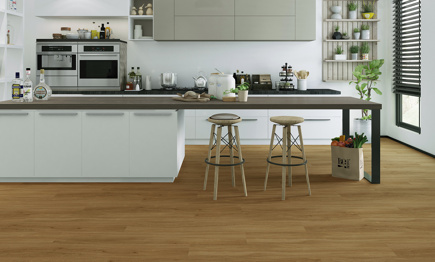
Step 1 — Read the room's light
Natural light changes how a colour reads. North-facing and dim rooms suit warmer, lighter tones that lift the space; bright, sunny rooms can carry cooler or darker floors without feeling closed in. Look at the room at different times of day, because a floor that looks warm at noon can look grey at dusk.
Step 2 — Factor in room size
Lighter floors make a small or narrow room feel larger and more open. Darker floors add depth and drama but can shrink a small space. In open-plan areas, a mid-tone is usually the most flexible, tying different zones together without dominating.
Step 3 — Match the undertone
Every wood-look floor has an undertone — warm (yellow, red, gold), cool (grey, ashy) or neutral. The undertone should harmonise with your walls, worktops and large fixtures. Clashing undertones are what makes a room feel subtly 'off', even when every element is nice on its own.
Step 4 — Work with your furniture and walls
Choose the floor around what stays, not what is easy to change. Match or deliberately contrast with your main furniture and cabinetry. A general rule: keep enough contrast between floor and furniture that pieces do not disappear into the floor, but not so much that the room feels busy.
Step 5 — Always test samples in place
Never choose from a screen or a small swatch under shop lighting. Get physical samples, lay them on the floor in the actual room, and live with them for a few days across morning and evening light. This one step prevents the most expensive mistake in flooring.
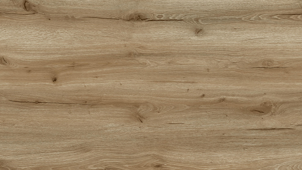
Timeless versus on-trend
If you change interiors often, a neutral mid-tone floor gives you the most freedom to restyle around it. If you want a statement, remember the floor is permanent and the room's largest surface — so make bold choices with intent, and keep the rest of the palette calm.
Choose by room job, not just room look
A colour that flatters an empty showroom may fight the life of the room. Kitchens and hallways live under crumbs, footprints, and dropped leaves, so they favour mid-tone, grain-rich designs that absorb daily evidence between cleans. Bedrooms can afford paler, calmer boards because traffic is barefoot and light. Home offices sit under desks and chair mats, where a quieter pattern keeps video-call backgrounds from shouting. Walk your day mentally through each room before choosing, and let the busiest rooms have the most forgiving floors.
The honest guide to hiding dirt and wear
Every floor gets dirty; colours differ only in how loudly they announce it. Very dark boards showcase dust, lint, and pet hair, especially in sunlight. Very pale, uniform boards highlight dark scuffs and shadows. The practical sweet spot is the middle band, honeys, warm greige, natural oaks, with visible grain variation that breaks up whatever lands on it. Matte, textured surfaces help too: EIR embossing scatters light so fine scratches and footprints read far less than they would on a smooth sheen. Households with dogs, kids, or gravel driveways should weight this heavily.
One colour or many? Flowing through an open plan
Modern layouts erase the walls that used to justify changing floors, and a single design run through kitchen, dining, and living space makes the whole footprint feel larger and calmer. Where you do change colours, change them at a natural threshold, a doorway or a step, never mid-space, and keep the undertone family consistent so the eye reads intention rather than accident. Upstairs can differ from downstairs without harm because the staircase acts as a visual reset. The rule of thumb: one floor per storey, transitions only where architecture already draws a line.
How texture changes the colour you see
Two planks printed with the same film can read differently once textured, because surface relief decides how light leaves the board. EIR texture, pressed in register with the grain, throws micro-shadows that deepen and complicate the colour, making it shift subtly through the day the way real timber does. Smooth glossy surfaces reflect light in sheets and flatten the design. This is one more reason a screen image cannot settle a colour decision: the pixel shows you the print, but only the physical sample shows you the print wearing its texture under your own light.
A manufacturer's view of regional taste
Ship the same catalogue worldwide and the orders map the world's tastes back to you. Northern European buyers pull pale, cool oaks that stretch scarce winter light. Mediterranean and Middle Eastern markets favour warmer honey and walnut tones. Australians order light coastal boards in long planks; North American ranges run wider and browner. None of this dictates your choice, but it explains what fills local shops, and it is why a broad range matters: within MILAT's three EIR collections and 54 designs, a distributor curates a local bestseller list rather than accepting someone else's.
Step by step
- 01
Read the light
Judge the colour in the room's own daylight, at more than one time of day.
- 02
Factor in size
Lighter tones open up small rooms; darker tones add depth but can shrink them.
- 03
Match undertones
Keep the floor's warm, cool or neutral undertone in harmony with walls and fixtures.
- 04
Work with furniture
Choose around what stays, keeping sensible contrast between floor and furniture.
- 05
Test samples in place
Live with physical samples on the actual floor across a few days before deciding.
Talk to MILAT Floor
Samples, specifications, OEM & private label, wholesale or export — our team is ready.